Frog Education Payment
Education, iOS mobile app UI design


Frog Education Payment
Education, iOS mobile app UI design
Frog Education is a K-12 education app. The android version had already launched. In 2019, the stakeholders decided to develop the ios version to target a larger market than before.
At the beginning of 2020, the online education market expanded rapidly because of the outbreak of Novel Coronavirus Pneumonia (NCP, COVID-19). Online education became the safest way to perform education and solve the situation.
In this project, we focused on user experience for payment. I was the team lead and UX designer working with 3 other UI designers to create a feasible solution for Frog Education.
UI Framework
Design Guideline
Product Analysis
Site Map & User Flow
Wireframe & Prototyping
Worked as the team leader and UX/UI designer
Collaborated with other 3 UI designers
Four (4) weeks in total
Design and prototype (Sketch, Adobe Photoshop, Invision, Zeplin)
Research and team collaboration (Trello, Zoom, Shimo document, SurveyMonkey)
Since Millennials gradually became the main group of parents, they were high educational background and willing to invest a lot of money for their children’s education. There are two main characters of K12 products. First, users and consumers are separated. The main users are K12 students, but their parents pay for their product usage. Secondly, it is hard to occupy the entire time from K12 students. Most of their studies are scheduled by their teachers and parents.
According to the existing sitemaps in the android version and competitive analysis, we revised the sitemap. The majority of existing functions remained as the requirement from the stakeholder. We added frog coins and more functions (everyday check-in, Coins Exchange) to the payment systems. The revision was proposed to enhance the coin use and recharge in frog education.
Revised Sitemaps (Yellow background is the new feature)
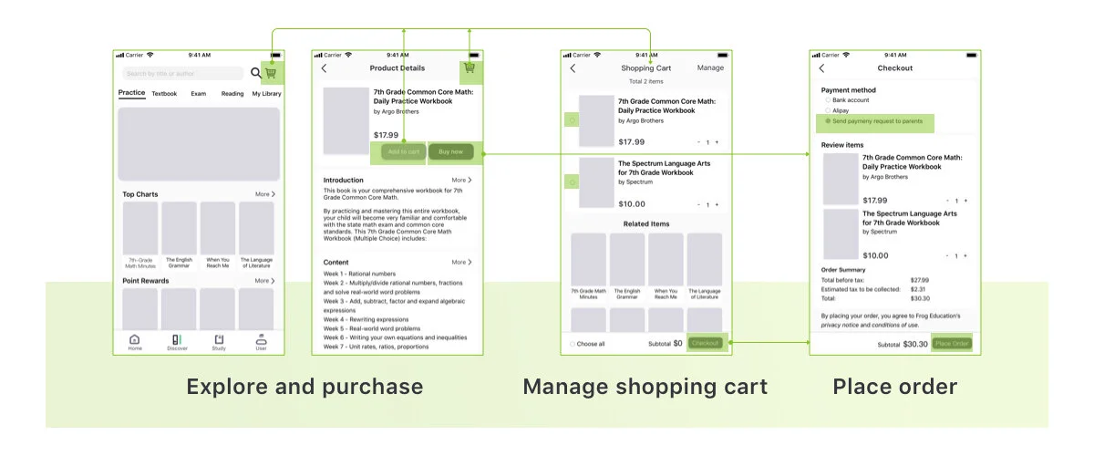
Users can explore the app, add items into the shopping cart, and handle the shopping cart management by playing with the hidden menu.
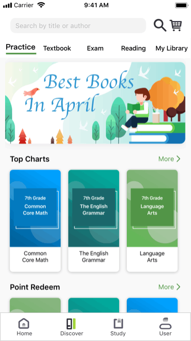
Explore
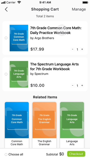
Delete
In order to find out the theme of the user interface, we extracted the product keywords from business strategies, product features, and user demands. Then, we developed the secondary keywords from brainstorming, searched for photos from Pinterest and Unsplash, and organized into the moodboard.
In order to create a consistent design style for the entire team, we created a basic style guide to define the design style of colors, typography, cards, banners, button, icons, and inputs.


